Saturday, 31 January 2009

FACEBOOK GROUP...


I have set up a facebook group concerning the issues around this D&AD brief. I wish to use this group to gather some of my primary research. Shortly I will be posting a questionnaire on the page that will also be sent to all members, which will ask questions relating to my main aims.

http://www.facebook.com/group.php?gid=20563904977

Friday, 30 January 2009

slumdog millionaire


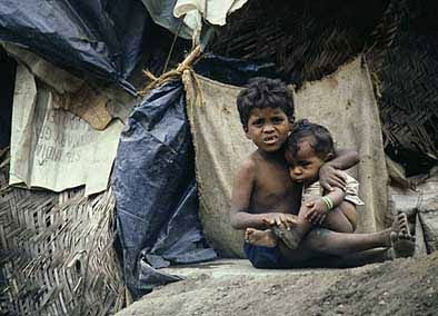
I went to see this film the other day purely for social enjoyment, however whilst watching it, it occurred to myself that its incredibly relevant to my research. The film is set in the slums of Mumbai and gives a cruel representation of the poverty that exists there. It presented the reality of their poor living conditions, living in fear and lack of food, water and clothing. From our point of view this is the stereotypical image of poverty.

I went to watch this film with my Mum, who found it incredibly upsetting and disturbing, as she doesn't have much insight to the world of poverty. It made me question the fact that for her its incredibly easy to sit back in her comfortable life and ignore the horrible truths that exist everyday in our world. Obviously the imagery presented by this film, of the reality of poverty is not something i want to show in my photo essay, i need to create something that inspires and pulls poverty out of the stereotype and convey a positive message.

RSA Journal... Slums Article


I found an interesting article about Indian slums in the RSA Journal April 2007 Edition, by photographer Cecilia Wilden. Photographers taken in the village of Tadinada, where the RSA are currently working on a project to help support the people that live there.

wealth/poverty...


wealthy people have too much/poor people have too little... make them meet in the middle... bridge that gap!

this is an illustration on a tshirt i have by illustrated people. I like the way the two opposities have been brought together in a peaceful sense where the values of each issues are dismissed because of the friendly use of illustration.

...the brief...

... changing people's perceptions of wealth and poverty...

but i was thinking, people obviously depending on their culture/upbringing, have different perceptions around this subject. In order to gain a better understanding I am going to create a questionnaire which i will send out to everyone studying MA, as this will give me a strong variety of cultures and ages.

I also need to visit wealthy and poor areas around London, this will allow me to see what visuals i have to work with, how they differentiate and how they could potentially be used within my narrative.

I visited my grandparents for inspiration this week and some interesting issues arose, such as the fact that people in poverty are in some cases happier than wealthy people, as they have less commodities to worry about and are under no pressure to lead a materialistic lifestyle. It was apparent in Barbados, when i visited in the summer their lives are incredibly simple. They live in, what we would consider, poor circumstances, however they were high spirited and contempt with their lives.

During this first week of research i have been having some thoughts on possible ideas for this brief. From the photographs i have viewed with similar representations around the subject of wealth and poverty, the majority of them feature people. Obviously the use of people in photography is a traditional way of presenting topics such as this. However i have a determination of creating something completely original, i would like to try and achieve this by avoiding using people in my narrative. Perhaps objects or other visuals can say just as much with a strong concept behind it and will also subsequently erase the opportunity for the audience to judge when people are presented.

Thursday, 29 January 2009

hussein chalayan


hussein chalayan...

I went with my housemate, who studies FPI, to the Hussein Chalayan exhibition at the Design Museum, and although its not got anything to do with poverty and wealth or photography, i found it incredibly inspiring and interesting! The creativity involved within his fashion designs is out of this world and the general feel of the exhibition was very futuristic and kept me engaged throughout.

It became apparent that the clothes he designs are not for high street fashion, but challenges the notions of fashion and takes it to a new level by creating designs which are so complex and experimental in their futuristic nature. One piece that stood out as being incredibly successful was a set of three costumes on a slow spinning platform, contained in a glass room that were rigged with several lasers. As the costumes were being moved around the red lasers created exciting patterns as it reflected from the glass, it was just something every different and unique.

Monday, 26 January 2009

no way...

http://eyemazing.co.uk/

idea...

have lots of different senarios - but the concept would be REFLECTION. Idea.. set in a beautifully decorated wealthy room, photograph a man looking into a mirror, from behind hes wearing a well tailored suite, clean appearance, however the image in the mirror is of a tramp. Or actually the other way round, so a tramp is in a dodgy room with an old mirror and looking back is this wealthy image of himself!? This could be applied to all ages and both genders, and in different means of reflection, such as shop windows.

when i typed wealth into google images...


When i typed in wealth their wasn't a huge amount of photographs showing fast cars, money and just general luxury as i had anticipated. The search seemed rather confused as to what to present. The images above present the stereotypical values of wealth, happiness, money, powerful people and materialistic lifestyle.

when i typed poverty into google images...


These are all the stereotypical images you associate with poverty. All contain a very negative narrative and we forget that these are people have skills and values they can add to the world. After looking through google images it became apparent that the common image perception of poverty is either starving child or tramp.

Brainstorming wealth and poverty...


This was a brainstorm to identify the stereotypical values of wealth and poverty.

THE BIG QUESTION!

The first thing i need to establish is ... What are people's perceptions of wealth and poverty??. This will allow myself to identify what needs to be changed!

Holding Hands!


I found this concept really interesting. Holding hands with someone gives off a sense of commitment and friendliness. This assignment set by 'Learning to Love You More', by Miranda July, has inspired an idea of putting rich and poor people together in different situations and photograph them holding hands, essentially portraying the message that wealth and poverty shouldnt be judged, we are all people of the world that have been born for the same reason. Was also inspired by this photograph by Vanessa Winship that I viewed in the National Portrait Gallery... Linking humanity. I find this photograph incredibly powerful, due to its cold and sinester nature projected through the expressions of the twins.

McCann Erickson - don't let poverty become landscape!


Thursday, 22 January 2009

Michael Snow... BFI

Just for a bit of inspiration i visited the Michael Snow exhibition at the BFI Southbank. As i'm not a huge fan of pretentious modern art i thought it was a bit pointless in its content, as watching sheep graze on a field is, in all honesty, not the most creative thing i have viewed.

Gallery Hopping... 22/01/09


The Hayward Gallery - Tim Lee

A rather bare exhibition with no real purpose. Probably spent an estimated 2 mins inside and walked out feeling incredibly uninspired. Although i read the intro piece introducing Tim Lee, i still wasn't too sure of what his identity is as an artist and the reasoning behind his work. It all seemed rather random in not a particularly engaging sense. Maybe i was missing something!

Gallery Hopping... 22/01/09


The Photographers Gallery - Katy Grannan (The Westerns)

My first visit to the recently moved Photographers Gallery in Soho. I must admit the most interesting part of the gallery was the bookshop on the 2nd floor. What a collection!
The exhibition was incredibly strange, but endearing. It presented two transsexuals photographed on the west coast of America. The exhibition presented a rather odd narrative but i quite liked the quirky play on the two transsexual best friends that seemed to be photographed very out of place.

This was a useful exhibition for my research, as it presented a photo essay of a woman that changes her character in each photograph, presenting a story of her personality.

funky colours...


A Dazed and Confused photoshoot.

Fashion Advertising


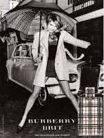
Fashion advertising just oozes wealth in so many different ways. The use of iconic models, such as celebrities, who are clearly incredibly wealthy people. The extravagant and expensive accessories these models are flourished with. In all fashion related advertising campaigns there is never any identification of poverty, this just wouldn't sell the product, everything needs to be as superficial and materialistic as possible, mirroring the lives of the people that buy into these products.

Annie Leibovitz


Here's a photo from the exhibit Leibovitz took in 1993 of AIDS activist and beseiged Rebecca Denison. I was particually inspired by this photograph as it brings up issues relating to wealth and poverty and presents it in a very creative and shocking visual. The words make it more than a photograph and the narrative is very strong, especially with the use of the red hands creating the heart, making it a very emotive piece.

Gallery Hopping... 22/01/09


National Portrait Gallery - Annie Leibovitz (A Photographers life, 1990-2005)

What an amazing exhibition of this woman's career! She has photographed just about every single famous person in the last 20 odd years. This just highlights the fact that she is such an inspirational and talented photographer. Every photograph was so different, they all contained such different styles, but all astounding. The narrative keeps you engaged in the photos, some i had to stand and study for minutes. She is most certainly my new role model and i'm excited to research her work further after visiting this exhibition!

Her photographs had a very 'wealthy' feel about them. Firstly the majority of them feature very rich and iconic people, such as celebrities and world leaders and secondly the settings and mise on scene of the scenes within the frame, were in most cases, extravagant and luxurious.

Monday, 19 January 2009

The Border Film Project


Border Film Project is a collaborative art project giving disposable cameras to two groups on different sides of the border: undocumented migrants crossing the desert into the United States, and American Minutemen trying to stop them. To date, we have received 73 cameras — 38 from migrants and 35 from Minutemen — with nearly 2,000 pictures in total. The pictures show the human face of immigration, and they challenge us to question our stereotypes and to see through new and personal lenses.

Sunday, 18 January 2009

World Press Photo

World Press Photo was an obvious choice of research source to gain valuable and inspirationalinsight into photojournalism and photography based around this key issue. What completely astounds me regarding the photographs entered into the World Press Photo competition is the breathtaking content that has been captured. It amazes me to think that that photographer stood before the scene and experienced it through their lens, being a part of the epic situation and atmosphere. It was interesting to reconsider what I had just experienced, as the spectator observing that very photograph, and how different my situation was to that photographer at the time of the shot.

Whilst flicking through the World Press Photo 2008 editorial I was shocked by the imagery in the majority of the photographs, astounded by their ‘real’ nature, I was looking at something that actually happened, so gruesome in many cases, however within seconds had forgotten what shear emotion I just experienced and that photograph no longer remains in my thoughts.

Baudrillard highlights an interesting theory that when we look at photographs we take an armchair position, which allows us to witness the danger portrayed in a very safe environment and displaced reality. As Baudrillard (1993) suggests…

‘We are just bombarded with information rich images every moment of our lives, and the only way we can cope with this, the only was we can resist the power of this information to take over our lives, is to accept the images only as signifiers, only as surfaces, and to reject their meanings, their signifieds. Consider television news. It is simply a succession of surface images, or signifiers, for the viewers to experience. People cannot recall last night’s news because there is nothing to recall, there are only images, only signifiers to experience.

The World Press Photo of the year 2008, above, is by photographer Tim Hetherington, titled ‘American Soldier resting at bunker’, photographed in Korengal Valley, Afghanistan. For me this piece didn’t particularly spark any sort of wow factor, however compared to other photographic entries from that year it appears to be rather subdued, which is perhaps why it is such a successful piece, as it allows the spectator to build upon the narrative rather than seeing a conclusive image. As the spectator you find yourself trying to comprehend what the soldier is experiencing, with a pained expression it’s impossible to avoid such emotive imagery.

In terms of the photographic quality of the image, it’s not a clear and crisp finish, its blurred and dark, which subsequently successfully adds to the nature of the piece. I learnt that the photographer, Tim Hetherington, unfortunately injured himself whilst working on this location. With a narrative as strong as the news story itself the photograph presents how an ongoing conflict with no definite end affects the individual and I would imagine the jury enjoyed this powerful photographic story regarding such a key current issue within the media.

World Press Photo 2006. The photograph, as shown above, is by photographer Spencer Platt and titled, ‘Young Lebanese drive through devastated neighbourhood of South Beirut’. World Press Photo jury chair Michele McNally (2007) describes the winning image as…

‘It's a picture you can keep looking at. It has the complexity and contradiction of real life, amidst chaos. This photograph makes you look beyond the obvious.’
When I first viewed this photograph it didn’t immediately strike me that anything was particularly wrong within this situation, also the fact that it’s quite a busy photograph with no obvious focal point. However when I examined closer it becomes apparent that these innocent Lebanese women have infact enter a dangerous zone, which is confirmed by the derelict building in the background at the fear attached to a couple of their faces. The photograph presents a bizarre comparison between reality and naivety, where these girls have entered a world in which they are clearly not accustomed with, which is why the jury thought this was an incredibly interesting photographic narrative. As Ghoussoub (2007) explains…

‘The photo does show the contradictions of a country where destruction and the love of fun are unbearably juxtaposed, or mixed together to the point of exhaustion. The background is brown and grey, as it is in reality. Like a devastating tragedy of rubble mixed with the colours of lost interiors. The car is sparkling red, and the white T-shirt of the blonde woman in the car or the handkerchief covering the nose of the woman in the sleeveless black dress are whiter then the shirt of a passer-by going about his daily routine; the passer-by too, as well as the woman wearing a headscarf, are living in this destroyed neighbourhood’.

World Press Photo exhibition video >

Saturday, 17 January 2009

TIME MANAGEMENT!


In order to inspire myself i went out and brought a large piece of paper and created a gantt chart by hand. I have stuck it too my bedroom wall, so i can be referring to it everyday rather than loosing track of time because its hidden away in a folder on my computer. This gantt chart is more thought out and in depth compared to previous gantt charts i have created. I have broken down each section of this project that needs to be completed in order to fully engage with this brief and have allowed myself a significant amount of time on each section in order to get the brief completed by the deadline.

As this is a 7 week brief, i have allowed myself 2 weeks to research, as i will need to gain a vast amount of information both gathered by primary and secondary sources to help educate and inspire my ideas around the subject area of wealth and poverty. During these 2 weeks i plan to visit a number of exhibitions (photographic and other disciplines), look through books and magazines, conduct a questionnaire on the issues/stereotypes/opinions/discussions surrounding wealth and poverty and look at existing organizations, such as the World Photo Press that deal with and exploit photography around this subject.

During the second week of research i will be using the information and imagery i have viewed in order to formulate a variety of ideas for this brief. Using the journalistic pyramid to break down the big ideas and themes. Then development of that idea will begin in the third week there i shall be entering the realm of photography and carrying out a series of test shoots, to start visualizing my ideas and testing what works and what doesn't work. This phase will also see the development of the narrative and establish a storyboard of what i wish to contain within each frame. After establishing exactly what i want to achieve out of every photograph within the essay i will then use 5 days within week five to photograph the narrative, which may include the hiring of models, space and props.

After taking the photographs a selection process will then need to be carried out, as i'm only allowed to submit five images. Any editing/implementing or re-shooting will be carried out in week 6, then the final images need to be placed on presentation boards in the final week. I work every Sunday therefore have assigned these days to be spent updating my blog and writing up a week by week reflection and putting work into my workbook template.

Obviously this time plan could be adjusted throughout the project due to unforeseen reasons, however this will be reflected upon in my workbook.

Semester 2... ideas for research

-Border Film Project
-World Press Photo
-Magnum
-Wolfgang Tilmans
-Guy Bourdin

A photo essay is a set or series of photographs that are intended to tell a story or evoke a series of emotions in the viewer. Photo essays range from purely photographic works to photographs with captions or small notes to full text essays with a few or many accompanying photographs. Photo essays can be sequential in nature, intended to be viewed in a particular order, or they may consist of non-ordered photographs which may be viewed all at once or in an order chosen by the viewer. All photo essays are collections of photographs, but not all collections of photographs are photo essays. Photo essays often address a certain issue or attempt to capture the character of places and events. People who have undertaken photo essays include Bruce Davidson, W. Eugene Smith and Walker Evans.


The main aims >

Create a photo essay of 5 images that change peoples perceptions of wealth and poverty, which:

1. Change the way people think about wealth and poverty.

2. Challenge the visual stereotypes associated and the gap between the two.

3. Confront and upturn the traditional concepts of what it means to be wealthy or poor.

4. Challenge the viewer to redefine or rethink.

5. Communicate about it in a new way or something original.

6. Present a strong and clear narrative and structure. (good story, pace, tone of voice)

D&AD.... THE BRIEF!!!


Friday, 16 January 2009

Victor & Susie: a snail tale made of type


Victor and Susie is a new children’s book from design studio Brighten the Corners, illustrated entirely from type. The story concerns Victor – a snail with a hole in his shell – and Susie, who decides to help him get better…

“The main idea was to stress the images and text equally,” explains the book’s author, Billy Kiossoglou of BTC, “and play with the fact that they’re both made out of the same ‘ingredients’, which are simply arranged and subsequently read differently. Children’s books often treat text and images like they belong to altogether different worlds and we wanted to avoid that.”

Kiossoglou also wanted to create a narrative that evoked the sense of rhythm and pacing found in comic books. “I didn’t want to rush the story,” he says, “but allow time for dialogue, and let Victor & Susie have the odd exchange about little things that weren’t really crucial for the story.

“Keeping the conventional third person narrative in the text, as opposed to speech bubbles, meant a parent could read the story to a child, while at the same time, the text treatment was sufficiently unobtrusive, not to annoy a ‘trained’ adult comic reader.”

Jose Parla