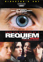
film people telling stories of their hallucinations ...
facebook group....
books, magazines, internet
Tuesday, 31 March 2009
* In 1969, Salvador Dalí produced 12 illustrations based on Alice's Adventures in Wonderland...


Dali’s incredible illustrations for Lewis Carroll’s “Alice in Wonderland” (published in 1865) have caused it to become one of the rarest and most sought-after Dali suites. With the original gouaches published by Maecenas Press-Random House, New York in 1969, the suite now contains 12 heliogravures - one for each chapter of the book - and comes with 1 original signed etching in 4 colors as the frontpiece.
This collaboration brings together arguably two of the most creative minds in Western culture, as both are considered ultimate explorers of dreams and imagination.
Friday, 27 March 2009
Tuesday, 24 March 2009
gwen stefani - what you waiting for!
The theme of the music video is based around alice in wonderland!
Sunday, 22 March 2009
Tuesday, 17 March 2009
Sunday, 8 March 2009
Friday, 6 March 2009
Wednesday, 4 March 2009
Olympic logo development...


I have been experimenting with serif fonts as i want the typography of the logo to feel very sophisticated in contrast to the fun and exciting icon made up of symbols relating to the games and Surrey itself. The typeface i have chosen is Times, a very famous typeface of the Times newspaper. From conducting research into Surrey whilst designing this logo i discovered that Surrey is represented by the Conservative party in all districts and has very strong right wing support, which i thought would be a nice play on using the typeface of a right wing newspaper in the logo, relating it directly to the people of Surrey.
Sunday, 1 March 2009
street story
Subscribe to:
Comments (Atom)


