Saturday, 29 November 2008

BRIEF 3 - WK1

Week one reflection

This week was pretty crazy, after deciding to take on this brief by myself at the start i then had a reality check that it was a pretty stupid idea as theres a massive amount of work required for this project. So i therefore begged Jakub and Shi to take me back... bringing imazing back together! As a team we work incredibly well together and i think this is a brief that we can be really creative with and come up with some pretty crazy revolutionary and evolutionary ideas for the imfamous red bull!

As i came into the team half way through the first week i had a lot of catching up to do on looking at varous energy drinks, history of Red Bull itself, the market, trends, other brands that have had successful campaigns etc. I actually learnt quite alot over the couple of days i spent researching. Branding is not something that i have really explored before, so was interesting seeing how companies have evolved their brands over years.

After the first week we have made a few decisions about what routes we want to take with the red bull rebranding challenge.

EVOLUTIONARY

- Natural energy drink (herbs) - natural energy boost.
- De-genderise - develop the identity into a more classy product, with no gender direction.
- white can with a gold logo - cut out of white, seeing the juice through the logo.
- tie in with the olympics 2012 - going for gold, strike gold - official sponsers of the olympics!
- ambient campaign - red bull challenge in the streets.

REVOLUTIONARY

- Natural energy drink (herbs) - natural energy boost. NO CAFFEINE
- Red Bull Kids
- Red Bull Pink
- Red Bull XXX - new drinks - opening up the market
- completely change logo!

Wednesday, 26 November 2008

RED BULL CHALLENGE IDEA!!!


Evolutionary idea - change peoples perceptions that red bull is a high in caffeine and sugar drink thats ultimately bad for your health, turning it into a natural energy drink thats healthy and can be consumed by everyone. This ambient campaign will highlight the fact that you can boost your energy levels by partaking in random small exercises to liven yourself up... after work, whilst shopping etc.

Red Bull obstacles around the strees, encouraging people to give themselves a natural energy boost. Can involve people of both genders and ages, get everyone involved! COMMUNITY SPIRIT!!

Put cctv cameras by the red bull challenges and film people to create the television advertisement!

Tuesday, 25 November 2008

a very useful website...

... www.brandrepublic.com

PUSSY!


This is our competitor.... its a natural energy drink, made with herbs (no caffeine, high amounts of sugar or dodgy ingredients they put in red bull!) Also they have adopted our idea for having a white can, that looks roughly the same shape and size of the red bull can!

Pussy is unique. It is made with a blend of fresh white grape juice from Southern Italy, pressed Mexican limes and lightly carbonated water. These are then mixed with Grenadilla and Lychee flavours, infused with six selected botanical herbs

BRIEF 3

RED BULL challenge....

Red Bull the energy drink that has had the same identity since it was launched in 1984! Therefore iMAZING is taking on the challenge of creating a new brand experience with a revolutionary approach and developing the existing brand identity in an evolutionary approach. Two big ideas to add value to the Red Bull experience.

Red Bull is a very masculine orientated brand, its associated with extreme sports and sponsors a lot of male associated sporting events, such as skateboard competitions and racing.

Because they have had the same identity in 22 years, its become one that is very much know and recognized across the world. The famous slogan, 'red bull gives you wings', has somewhat faded now and they are lacking a current witty/humorous campaign for their target audience. An audience that is very much intrigued with
sexual innuendos and naughtiness.

Our aim is to create a campaign and new identity for red bull which isn't so gender orientated and that can appeal not just to their market of 16-29 year olds, but perhaps discarding their red bull cola drink and producing healthier drinks for
children and elderly people.

iMAZING IS BACK!

Working by myself on this project would have been a hell of a lot to take on in such a short amount of time. I was also having doubts about my idea for the project, as the concept of taking a food/drink brand and inventing a healthy sub brand for it was becoming an increasingly unexciting task for me. I need to be and feel 100% positive in what i'm doing to achieve a successful execution of the brief.

Therefore in the tutorial of the 25/11/08, I begged my way back into iMAZING design, which I'm very happy about and not entirely sure why i didn't want to work with them in the first place! I guess its because i had an idea about re-branding the 5 a day identity and didn't feel they would want to take on a brief like that, but it was one that i fancied tackling for a while now.

iMAZING are re-branding RED BULL yaaaa

Monday, 24 November 2008

FCUK


French Connection

A brand that is very much targeted at a younger audience. It was successful/controversial because of the play on swear words and sexual connotations. 


http://www.mintel.com/

Friday, 21 November 2008

Notes on branding


Branding


‘More than a name – an introduction to branding’, Melissa Davis.

A product is the thing that you buy and use.

A brand is the promise of something. That something is intangible; it could be the guarantee of quality, a sense of prestige, or of heritage.
Brands also offer a differentiating factor that makes it easier to choose between the many different competing variants.

Branding is important because of its relationship and impact on the world we live in. Brands affect peoples lives simply because they are part of our daily choices and decisions.


SWOT analysis

Strengths – things we are doing well.

Weaknesses – things we are doing not so well. – correct them by raising/lowering price, improving quality, updating design.

Opportunities – Are the competitors weak in a particular area? Are new markets developing? Is there a new trend? Gaps in the market!

Threats – Are competitors developing new products? Are customers getting tired of what we have to offer? Has technology left us behind?


O2 branding – with the bubbles – core concept of mobile communications as being ‘essential for living’ – oxygen is essential for life and the symbol 02 symbolises the ubiquity of the product.

Apple – ipod – taken apple out of its realm as a niche computer market.

Innocent – pure unadulterated fruit – no preservatives – nature theme. The tone is humorous, honest and simple.

French Connection (FCUK) – controversial, clear target audience.

Brands start with a great idea that tells a good story.

Fun is a way of enhancing the brand experience and giving a good impression.

4 Ps – product/place/price/promotion – pg 158

Top Tips

1. Be fully briefed on the brands audience
2. Decide on the most effective channels to reach your audience
3. Analyse how the brand speaks to its audience
4. Make sure the graphic design reflects the character and values of the brand
5. Be as creative as you can

Wednesday, 19 November 2008

brief 3


marketing considerations chart!


very useful for me to take all the elements into consideration when i'm producing my new brand!

(image taken from: What is packaging design? by Giles Calver)

BRIEF 3 - '5 a day' existing material


Considering this was launched as a global campaign, targeting just about everyone in the country, highlighting major health issues you would of thought they would have produced some phenomenal brand experience. But instead they merely created this uninspiring identity, which is barely visible on the packaging of the products involved. There's no advertising in supermarkets promoting the campaign, evidently resulting in customers being oblivious to the importance and potential global success of this concept. The brand identity of the diagonal line of squares and the tag line, 'just eat more', is in fairness not going to encourage consumers to eat their 5 a day, especially when like i said before you barely even notice its on the packaging of the fruit and veg. People are not stupid, they already know that 1 apple = 1 of your 5 a day, the problem therefore lies within the packaging, accessibility and promotion of the product.

5 a day has its own website, run by the NHS. The website has that health/medical feel about it, with a rather rigid and corporate appearance, which in no way inspires the importance of fulfilling your 5 a day. However it contains all the contents and ideas that are needed to influence people to maintain a healthy diet, but lacking the promotion and interactivity I dont believe this site recieves many hits daily by people interested in learning about ones quest to eat their 5 a day! Personally unless i was doing such a project as i am now, i dont think i would of ever visited this site!

BRIEF 3 - 5 a day' existing material

BRIEF 3!!!!!


SUCH AN UNHEALTHY/HEALTH CONSCIOUS WORLD WE LIVE IN!


IDEA:

The ‘5 a day’ innovation!

5 a day ... as a brand with a product range!

Add value to the 5 a day identity

Rather than being a chore

Rather than just placed on food/drink because it has to be for food standards laws – its not promoting it

Who - Students/ children / working people

How do you encourage people to meet their 5 a day??

Packaging and graphically rich and interesting situation of the product will be the most important part of this re-branding campaign.

-Each potion packaged separately – cheap – cost effective

-Deals: 2 portions for a quid (people love deals!)

-Fast healthy food – additions to purchasing a sandwich – will need to be placed next to the lunch food section.

-grab it on your lunch break – put it in your kids lunch box – really interesting packaging!

-Food (fruits) Drinks (juices, smoothies)

- They are currently trying to promote it – but all the advertising/promotional material for the existing branding is boring, corporate and doesn’t appeal at all to the main target audience which is young people (kids and students) also has to appeal to the parents too push and interest their kids in meeting the 5a day requirement.

They are doing all these schemes etc, but at the end of the day it needs to be advertised better in its location. Needs to be more shown more predominantly that its part of your 5 a day.

Numbering systems – each potion is a number – how many packages of fruit/drink could be done?

There’s no additional advertising in supermarkets etc for 5 a day, people need to be reminded whilst shopping.

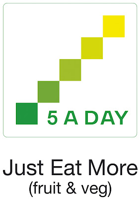
The existing logo is barely noticeable on packaging

The 5 a day brand could be situated next to sandwiches.. act as an additional snack section – portions of fruit to buy with your sandwich.

- could have deals – free portion of fruit when you purchase a sandwich or salad.

The target would be for the customers to purchase 2 or 3 portions of fruit or drink.

Persuasive advertising when you walk into the store. Leading you to the 5 a day section

‘will you be eating your 5 a day today?’

make them feel guilty if they haven’t thought about it!

Kids… use characters and freebies to entice them to want to get involved with the 5 a day campaign.

The idea I want to encourage is that people should have 1 fruit drink (orange juice/smoothie) 2 portions of fruit (brought from the 5 a day range) then have 2 portions of vegetables with their dinner! Then that’s your 5 a day done!

Packaging would have to be eco friendly! Easily destroyed, or reused, biodegradable etc. GREEN!

Guerrilla advertising – do something absolutely mental to advertise this brand!

Wall chart for children – can use the free things they get within the packaging to complete their wall chart.

Things to do:

Take photos of :

-‘lunch’ sections in supermarkets – space/fridges etc
- products that have the 5 a day branding on, where is it placed, how big is it!
- any advertising instore that I see promoting the 5 a day campaign.

Look at the existing promotional material of the current branding – is it successful? How can it be improved?

Look at food branding and packaging – competitors

Create mood boards of research – influences – other food/drink brands that have successfully re-invented themselves recently. – and their campaigns. Advertising for fruit and juice drinks

Who’s the target audience! This could be where I tackle the 2 perspectives.

Add on’s – badges/books/things to go instore… place advertising where the brand in situated

added value… product make it more friendly and different – make it stand out
Branding the environment

Completely change the name!?
5 a day could be the sub line

Monday, 17 November 2008

Brief 2 - PRESENTATION REFLECTION

Feedback

Strengths:


- The whole presentation was a brand experience of myself – reflected the nature of the concept.
- Good use of presentation tools – video, paper, sound, slides.
- Good reflection on research methodologies and how it influenced my ideas, from the research, influences and experiences I undertook throughout the project.
- The brief was to ‘design’ the website, not having a finished website, due to my lack of expertise in this field, actually worked to my advantage. It left audience wanting to see more, rather than showing a completed working website which projects a sense of closure on the project.
- Successful reflection at the end of the presentation, explained clearly the strengths and weaknesses of the project and my PDP.
- Talked to the audience, making them feel very much involved in my thought process and reflection.
- Added value to everything!
- An innovative concept that’s contemporary and different that successfully shows the identity and brand experience of Lucy Weston as a graphic designer and creative. I believe I met requirements stated on the brief and met my own personal aims for this project.
- Have determination to use the skills and knowledge I have learnt from this website project to actually build my concept into a working website.


Weaknesses:

- Would have been good to have had 2 perspectives – show two different concepts – one evolutionary, one revolutionary.
- Use the presentation not only to show my personal journey throughout the project, but also to incorporate some information that I can teach the audience, to make them feel like they have learnt something valuable from the presentation. Like Shi achieved, he educated us on the history behind his identity and talked in-depth about artists/designers that influenced his work and why.

Personal reflection

The more and more I present, I am beginning to feel more confident. Already I feel I have progressed so much since my degree, where I was always quite timid in talking about my work, and didn’t really understand how to. Reflecting on research methodologies and the question of ‘why’, is becoming more and more comforting to reflect upon and talk about in my presentations. I was never encouraged do this on my degree, but as time goes on I’m beginning to recognise how incredibly useful and important it is to reflect upon everything you do as a designer and why you do it. It’s such a rewarding experience when you put the journey of the project together and can see how much improvement and development has been achieved, in not just the work but yourself as a maturing and nurturing designer over the short period of time we have to produce the work for these first semester projects.

Sunday, 16 November 2008

looming...

done done done.... all ready for the presentation!

Saturday, 15 November 2008

BRIEF TWO - SCREEN

REFLECTION

First off it was a challenge for myself as I have never touched on website design throughout my education, therefore I have a lack on knowledge in this field of design. Which is why I’m glad it was a brief in the first semester, as I believe I have learnt a lot from it as I am now more familiar with the technical terms and what they mean.

I believe it is such a crucial part in design these days. If you don’t have a website how do you sell yourself as a designer!? And because there are so many websites, how do you make yours different and more special than the others. BIG IDEA!

Problems:

Early on I found it hard visualizing my concepts - how to show movement through still drawing and imagery. This is where I realized that storyboarding is so important. Obviously I wanted a really interesting and visual website with movement that I wasn’t too sure how you would create digitally.

The photoshoot - the first test shoot I did of the concept was carried out in my house, with a sheet for the background and no additional lighting than the light on the ceiling, so there was a lot of shadow and made the imagery appear quite student like. So I wanted for the final shoot to be located in the photo studio where I could get a nice clean crisp white background. However it was all booked up in the time I had to complete it so I borrowed some lighting from uni and made the white sheet more secure on my wall, hoping the pictures would come out better. Which they did, however the background still contained some shadow, but actually didn’t look too bad! It almost complimented my slightly unclean and quirky personality.

BRIEF TWO - SCREEN


ANIMATION

One of my main aims was to provide the user with some sort of interactivity to keep them engaged in my website. So i have incorporated a draw on me section, where they can write/draw all over the screen, which then can be cleared with a click of a button!

Throughout the whole animation i never look directly at the camera. I intentionally decided not to do this as i want to make the user feel comfortable using my site. It appears that i'm just getting on with animation myself, not trying to gain attention or eye contact with the user.

Blinking and waiting poses throughout the animation make it feel more live, like i'm actually behind the screen waiting for the user to take control of my actions.

BRIEF TWO - SCREEN


WEEK THREE


After researching stop frame animation i had a better idea of how it could work with my concept. So during this week i created a story board of my concept, documenting how it would work frame by frame. I also conducted two photoshoots of myself carrying out the actions for the imagery on the website, this proved to be quite a tricky task as i was unable to book out the photostudio, so therefore had to borrow some lighting and shoot in my home. I really wanted to achieve a white background behind myself to produce a more professional clean feel, but with slight technical issues the images didnt come out quite how i indended. However as i am not a particually clean and crisp person myself it actually links quite nicely with my personality!

Thursday, 13 November 2008

most amazing stop motion animation!

Brief 2

THE BIG IDEA!!!

Finally the big idea has come to me. Whilst sat in my lounge watching tv, feeling rather unmotivated it suddenly clicked after listening to Richard Sawdon Smith and talking with my mum about her companies website, that i should use myself in my website! WHY NOT!

WHAT

A stop motion animation of myself creating a live mind map on screen, presenting my work, blog link, contact details and profile. I will be situated mid shot in front of a white background, and an imaginary interactive screen before me. The user will feel engaged as interaction will play a major part in the aestitics of the website. They will be able to use a pen to draw over my face on the main menu screen. And will have control over flipping various images and selecting the sections they desire. Predominantly it will appear that the user is in control of my actions. The aim is to visually represent my creativity through animation with a simplistic and unique concept.

WHO

The main target audience will be fellow graphic designers/agencies interested in viewing my work and myself. I want this website to sell myself, exposing my creativity through the work shown and the actual concept and design of the website itself.

It is important for me not to make the user feel overwhelmed or uncomfortable by my presence on screen, so I purposely avoid looking directly at the camera throughout the whole animation.

HOW


Stop frame photography, then all jpegs would be upload onto the screen and the animation would run through. I have no experience in web design, so i may need some assistance!

Brief 2 - influence


RICHARD SAWDON SMITH


After attending a lecture by Richard Sawdon Smith, who uses his own body in a large proportion of his work, gave me inspiration and the idea to use myself on my website. I believe people have perhaps distanced themselves from this visual concept, as people are perceived as being quick to judge. However I believe if its done in a quirky and innocent manner then it shouldn’t be an issue.

Week 2 - Case study


From my research it occurred to me that not one professional I looked at used their own face on their website. The company in which my mum works for, Intermail Plc, a mailing house in Newbury, has the most terribly designed website. Bad navigation, boring graphics, no interactivity, the list goes on. They recently put a picture up of my mum on the site next to the contact details and ever since the phone has not stopped ringing. Having a face to a name somehow makes the user feel more comfortable in contacting the person in question. By seeing their personal appearance they feel more engaged with that person, almost like having an initial insight into them.

Week 2 - Inital Ideas


BRIEF TWO - SCREEN


WEEK TWO:

After having an extensive look into existing websites, and commenting on their themes and design compositions i began to start thinking about possible concepts and directions for my own website.

I began this week really considering my identity, how i project myself as a designer and individual. I had a look at my existing branding that i created whilst studying at degree level and i feel i have greatly matured and developed since then, therefore my branding needs to compliment where i stand now.

I conduced several brainstorms into my identity, pinpointing key aspects of myself, such as my interests, skills and future aspirations.

Brief 2 - Research

Whilst exploring websites by individual designers, musicians, photographers etc. It became apparent that they all followed a rather similar theme. Most displayed the website contents in the top left hand corner, being the place that is generally viewed first by our gaze, and the work/body copy placed to the right. This theme in my opinion is incredibly over done. What makes you stand out as an individual when your website has the same composition as hundreds of other designers out there. It shows clean layout design but where is the creativity?

My main objective is to create something completely new!

Brief 2 - Research


www.noonebelongsheremorethanyou.com

This website is one of the most simplistic yet creative websites i have come across in a while. There's no complication, its incredibly easy to navigate and successfully sells the product in a quirky manner. Being the user you are in control over the pace you proceed through the screens and unfolding this witty narrative is an incredibly exciting experience. The simple use of hand rented type on a kitchen stove, then photographed to create the basis (big idea) of the website is beautiful. I believe one of the most successful aspects of this website is the fact that you don't walk away from it, the not knowing whats on the next screen keeps the user engaged and guessing. Its a mystery as to what the website concludes with. And even when you get to the end and land on the last page, i couldnt help but want more.

BRIEF TWO - SCREEN

WEEK ONE:

This week very much consisted off looking at existing websites, from design agencies to car companies. I discovered a very common theme within the graphic design field of websites, which was that the design agencies tended to have a very corporate associated website theme whereas the individual designers had produced more creative and personal websites to not only project their branding and identity but to ultimately sell themselves as designers.

Below i have created a list of the websites in which i found very influential for a number of different reasons. The ones that generally captured my attention were ones in which allowed the user to feel engaged with the site, enabling interaction and control over the functions.

Within this week i also had some initial thoughts about the theme of my website, also what i wanted my website to say about myself, both personally and professionally.
So i set myself some main aims to aid my thinking and ideas:

- Reflect my personal identity and personality, also the style of my practice.
- Be creative, interactive and engaging.
- Clear and easy to use – simple navigation.
- I want it to sell myself as a graphic designer. Use it for potential employment.
- Audience – people within the industry to view my work, for interest or employment purposes.
- Strong narrative that keeps the user fully engaged in the website. Giving them control over several aspects to keep them involved and interested.